

CASE STUDIES
Sweet-talking is easy. The proof is in the pudding.
Dip into my client case studies to understand what I do and why it works.

Walnut Barn Estate | Social Media Management & FULL WEBSITE COPY REWRITE
Sector: Tourism/Hospitality
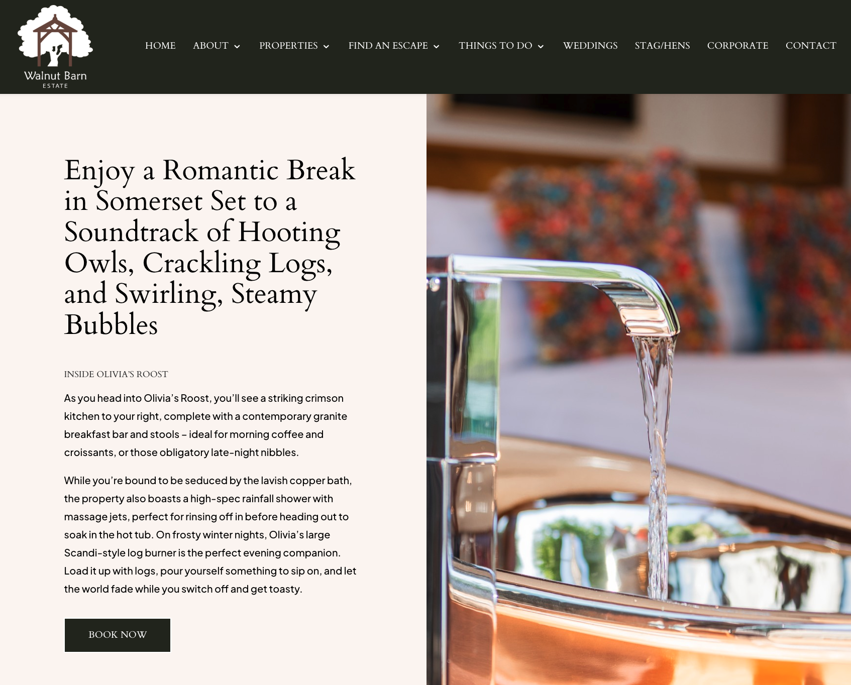
Walnut Barn Estate provide glamping properties, traditional cottages and large holiday homes to let in Somerset. With a stretched team and inconsistent branding, the company weren’t quite connecting with their mixed target demographics on socials. They were also struggling to convert customers from socials due to their dated website and copy. This was disrupting the customer journey and meant the team needed to host their properties on a wide variety of external accommodation listing platforms to get the properties booked.
To fix their social media issues, Walnut Barn needed streamlined social media management and a fresh visual identity that could speak to everyone from young groups to wellness enthusiasts. For the website, a total rewrite was required, along with new landing pages to go on a brand new site.
After switching up their socials and creating natural, keyword optimised copy for across the new site, I doubled their organic reach and engagement on Instagram, successfully supported their applications for local self-catering and Green Tourism awards, and secured page 1 and 2 rankings for their primary search terms, using an inviting new brand voice that has significantly boosted direct bookings.
Social Media Goals:
To free up the reservation manager's time for other responsibilities.
To freshen up the company's organic socials with a more ‘grown-up’ yet playful aesthetic to represent their character and quirkiness.
To develop a warm, conversational TOV that would appeal to a wider/more diverse audience, including millennial glampers, older wellness lovers, 20-something groups, and couples after luxe, relaxing breaks.
Website Copy Goals:
To modernise the brand voice while increasing copy depth and value across the site.
To deliver a one-off SEO strategy, including keyword optimisation and metadata, to secure long-term rankings for primary search terms without the need for an ongoing SEO package.
To streamline the digital customer journey from social media and ads to the website, removing friction and preventing drop-offs at the point of booking.
To drive a measurable increase in direct website bookings, reducing the brand's reliance on high-commission external listing platforms.
Social Media Actions:
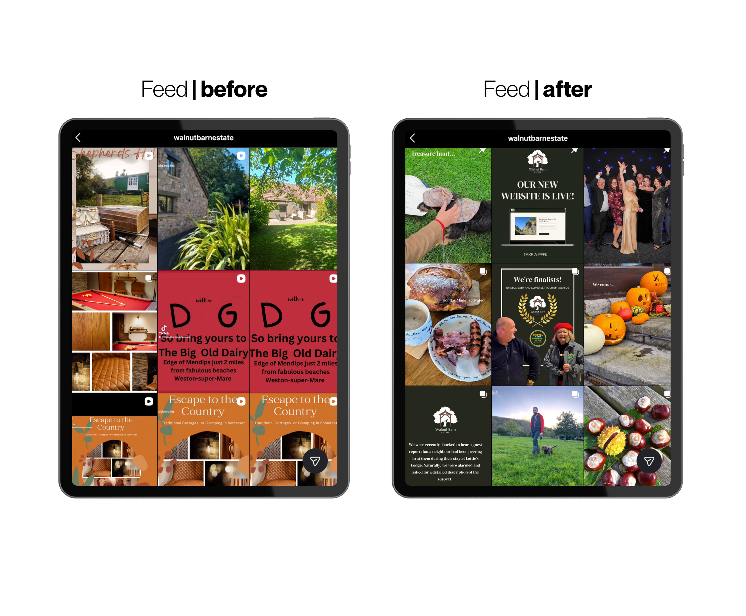
Added more unique and trend-led content, such as inventive reels, carousels with music, stories and post highlights to help Walnut Barn stay current
Streamlined font use to reduce busyness and inconsistency
Used local hashtags and local-themed posts to engage community and build authority in Somerset
Blended client videos and imagery with stock footage to create engaging and innovative visual narratives
Pinned posts to highlight events, deals and announcements
Regularly tagged suppliers and used location markers to widen post visibility
Carried out visual grid planning to create a cleaner, more harmonious aesthetic for new visitors
Reposted reels to TikTok for wider visibility and created a new YouTube account with bespoke graphics
Freshened up graphics, icons and relevant posts to match new website for a seamless transition
Used sporadic pops of colour within imagery to add a touch of personality and character while preserving the core brand aesthetic
Built customer loyalty by engaging with comments
Used campaign-led content around wellness and the environment to support sustainability and tourism award goals
Copy/SEO Actions:
Created specific, SEO-friendly landing pages for weddings and dog-friendly breaks to tap into the estate's two main focuses for the upcoming year
Built out directory-style pages for local walks and activities to help the site rank for regional searches while giving guests a better stay
Added meta titles and descriptions along with internal and external links to help Google find and rank the site
Created dedicated landing pages for diverse audiences, ensuring everyone from wellness seekers to large groups feels catered to
Adopted a sophisticated yet welcoming tone that feels like a natural extension of the estate’s social media
Lengthened the copy and added much-needed detail across the site to hold its own against the likes of Booking.com and Airbnb
Designed a series of ‘Stay Upgrade’ sections to showcase bookable extras, making it easier for guests to customise their trip and for the estate to boost revenue
Optimised every page with high-volume, low-difficulty regional keywords to make them work as both organic results and effective landing pages
Integrated ‘from’ pricing across property pages to capture and convert price-sensitive visitors
Introduced detailed FAQs and facility descriptions to answer guest questions upfront and clear the path to a direct booking
Defined the page structures before the build, providing the web developer with a clear, copy-first framework to design around
Social Media Impact (2024-2025)
Content interactions ⬆1.8K (100%) on Instagram despite scaling back activity across multiple months to focus on website rewrite
Post reach ⬆ 7,457 (100%)
Followers ⬆ 816 (83.6%)
Helped the business achieve a Gold Self-Catering Property Award for 2025
Increased engagement and interest from the Instagram wellness community, local Somerset community interest companies, and glamping enthusiasts
Helped the business move from a Bronze to Silver Green Tourism Award
Created custom sustainability and green tourism pages, aligning the site’s sustainability copy with Green Tourism criteria

Website Impact (2025)
Search visibility ⬆ Lifted previously unranked pages onto pages 1 and 2 of Google for high-competition regional keywords
Direct bookings ⬆ Achieved a measurable increase in website bookings, successfully reducing the reliance on third-party listing sites
Bounce rate ⬇ Improved the on-page bounce rate by creating a more engaging, intuitive journey from the moment a user lands
Saw a higher percentage of visitors move from the homepage to the booking engine thanks to clearer ‘from’ pricing and trust-building copy
Increased the volume of high-quality enquiries for weddings and large-scale celebration houses through dedicated landing pages
Provided written evidence needed to secure a Silver Green Tourism Award and a Gold Self-Catering Property Award
Boosted the average time spent on site as guests explored the new local activity guides and ‘Stay Upgrade’ sections
CLIENT COMMENTS: “Working with Maddie over the past few years has been an absolute pleasure. She has an incredible ability to capture the essence of all seven of our unique properties, showcasing each one beautifully and highlighting its individuality, which isn't an easy task. Her attention to detail is unmatched, and her creative content truly stands out. Beyond her talent, her wonderful personality shines through in everything she does. She just gets it! And that's what we love.” – Sharon Malone, Manager, Walnut Barn Estate
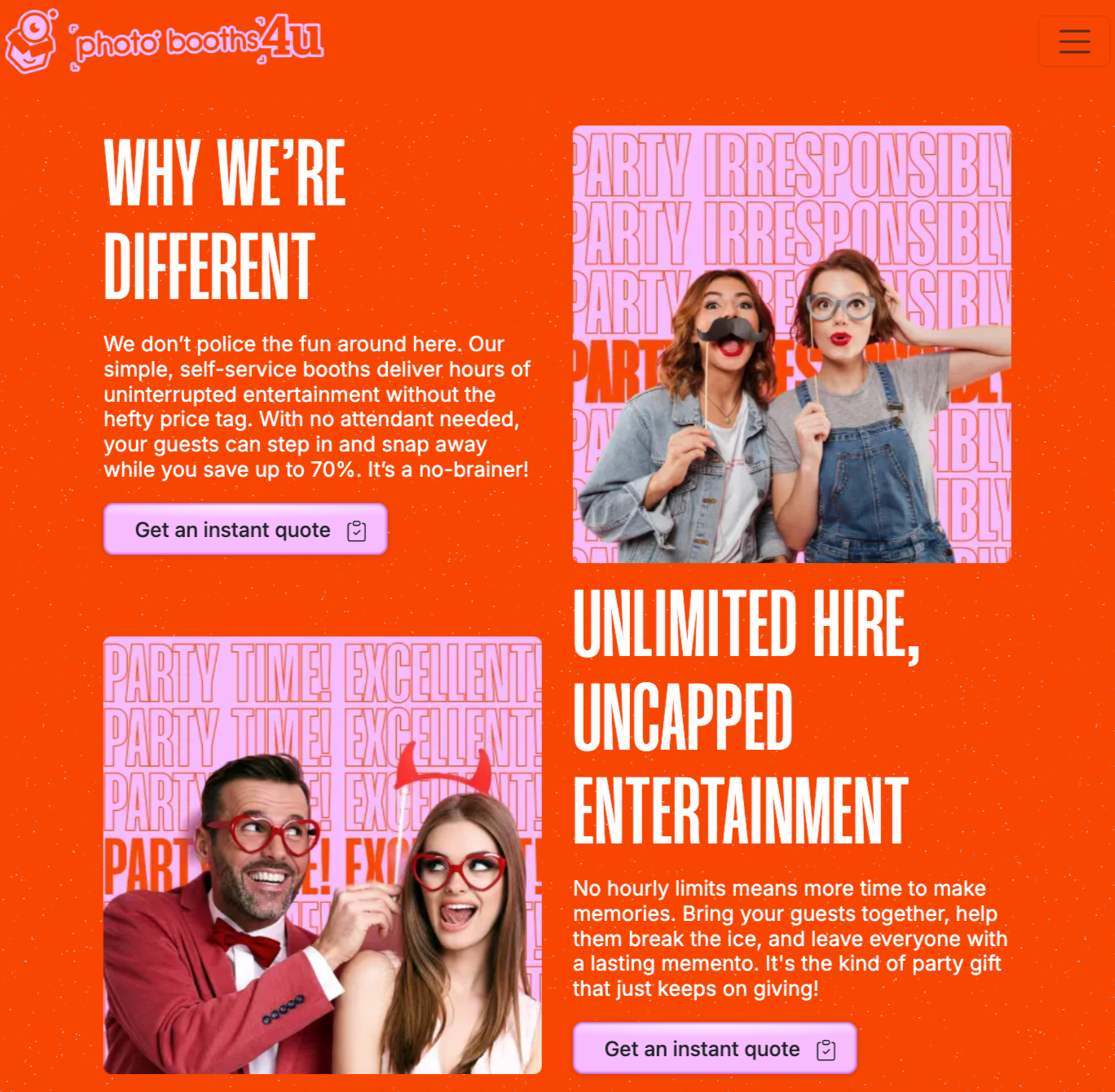
PHOTOBOOTHS 4U | LANDING PAGE RE-WRITE & web template mockup
Goals:
To stand out from competitors and alleviate doubt by addressing key customer pain points
To transform the customer journey into a simple, easy-to-follow process, designed to encourage conversions
To attract a wide audience of party planners hosting weddings, birthdays, family celebrations and corporate events
To cross-sell products from the client’s sister sites
To create a clear, intuitive mockup that could be adapted by the web development team
To add character and playfulness to the copy in order to match the new brand direction
Sector: Events & Entertainment
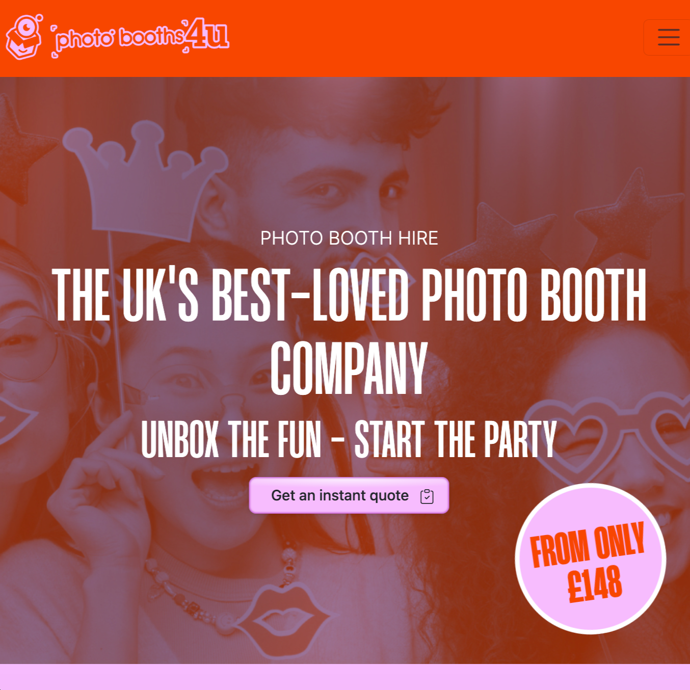
Photobooths 4U provide rentable photobooths for parties, weddings and big events. They approached me during a brand refresh, requesting fresh, all-in-one conversion-focused landing page copy designed to showcase their product offering and encourage instant quotes.
Aware of my marketing and design experience, the client also asked me to help them with strategy and design consultation, since their old website was outdated and wasn’t supporting conversions. This led to me creating a multi-page design strategy document and full-colour site mockup that was used by the web development team to create a clean and intuitive new site.
Actions:
▫️ Carried out an in-depth review of the client’s existing site, assessing all elements and functions, and noting down areas for improvement.
▫️ Researched client’s key competitors, including reviews and web designs, to better understand market and potential pain points.
▫️ Put together an in-depth copy and site restructure strategy document designed to maximise conversions and simplify the customer journey. This provided reasoning for proposed copy decisions and highlighted all key pain points and solutions.
▫️ Designed streamlined upgrade and add-on options to cross-sell client’s other products and gamify booking experience.
▫️ Created a contemporary, full colour website mockup from scratch with conversion-focused suggestions and ideas.
▫️ Put together a multipage copy document that included fresh, conversational headers, tag lines, product descriptions, CTAs, microcopy and packages.
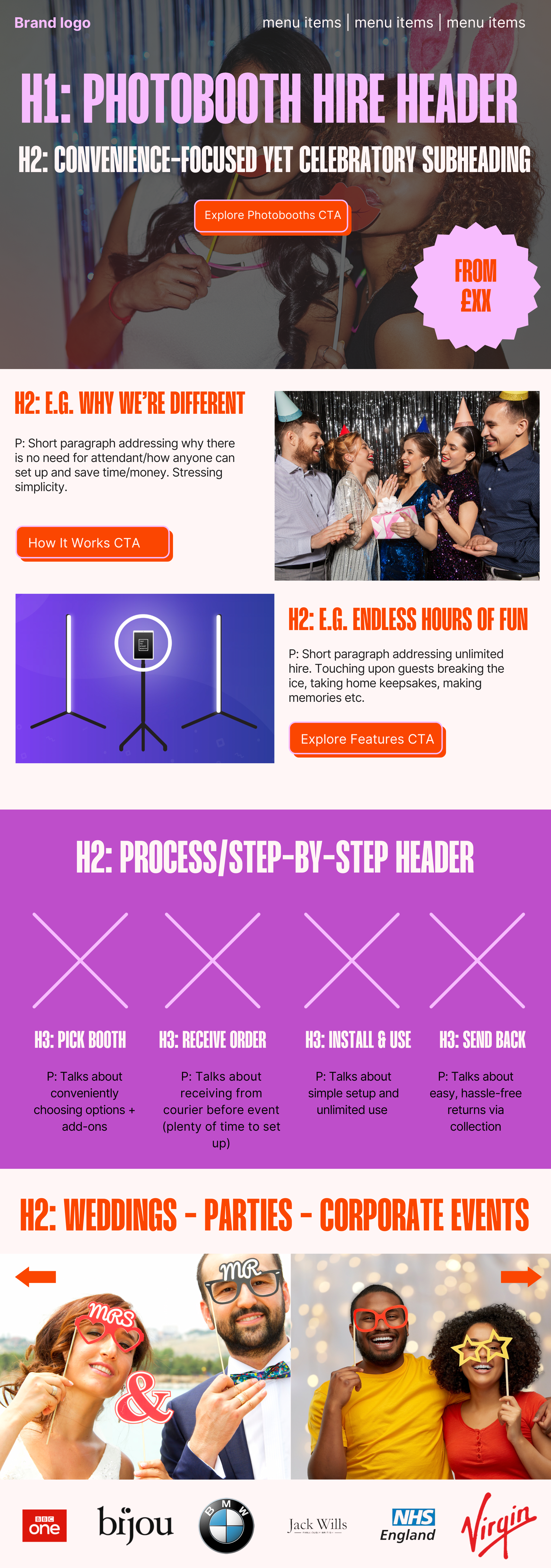
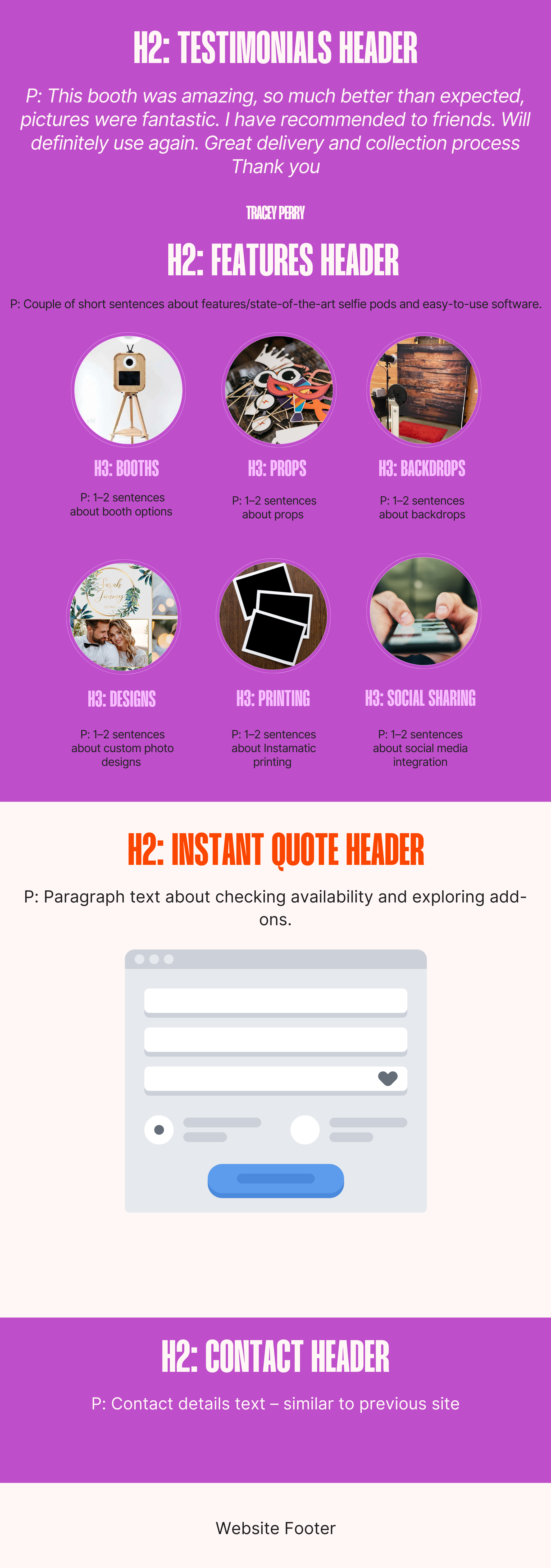
Photobooths 4U landing page mockup
Outcomes:
Helped the client to create a sleek and modern landing page that promotes a cleaner and more intuitive user experience, reducing decision paralysis and setting them up for conversion success.
Produced a fully mapped-out, conversion-focused mockup ready for the web development team, plus a comprehensive copy document that reflects the new brand direction with its fun, energetic feel.
Resolved previous customer pain points through carefully considered solutions housed within slick headers, straplines and FAQs.
Successfully increased awareness of sister sites and other related products for hire with new upgrade features, creating cross-selling opportunities.
Boosted transparency, credibility and trust using the new testimonial section and 'from pricing', helping to make the brand more competitive.
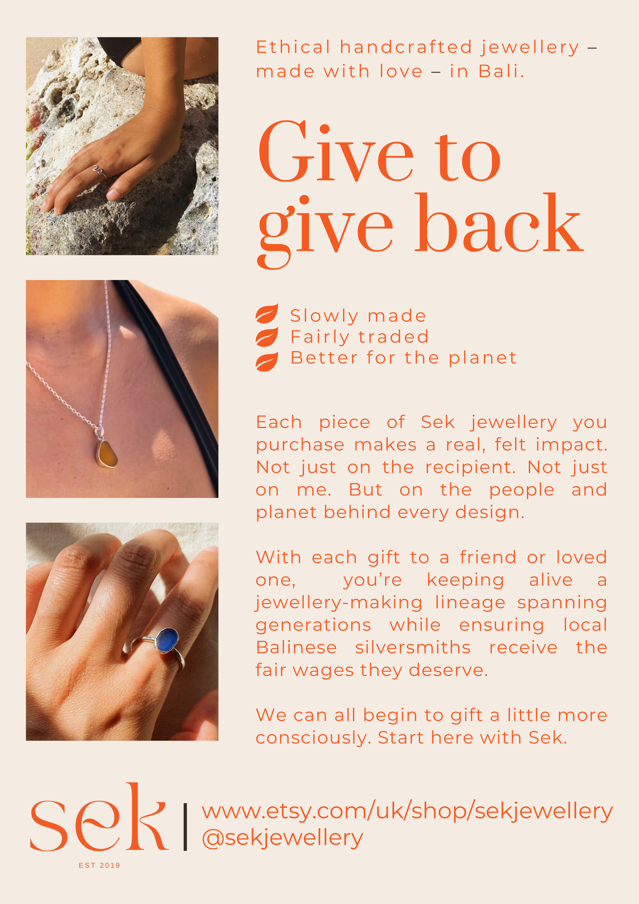
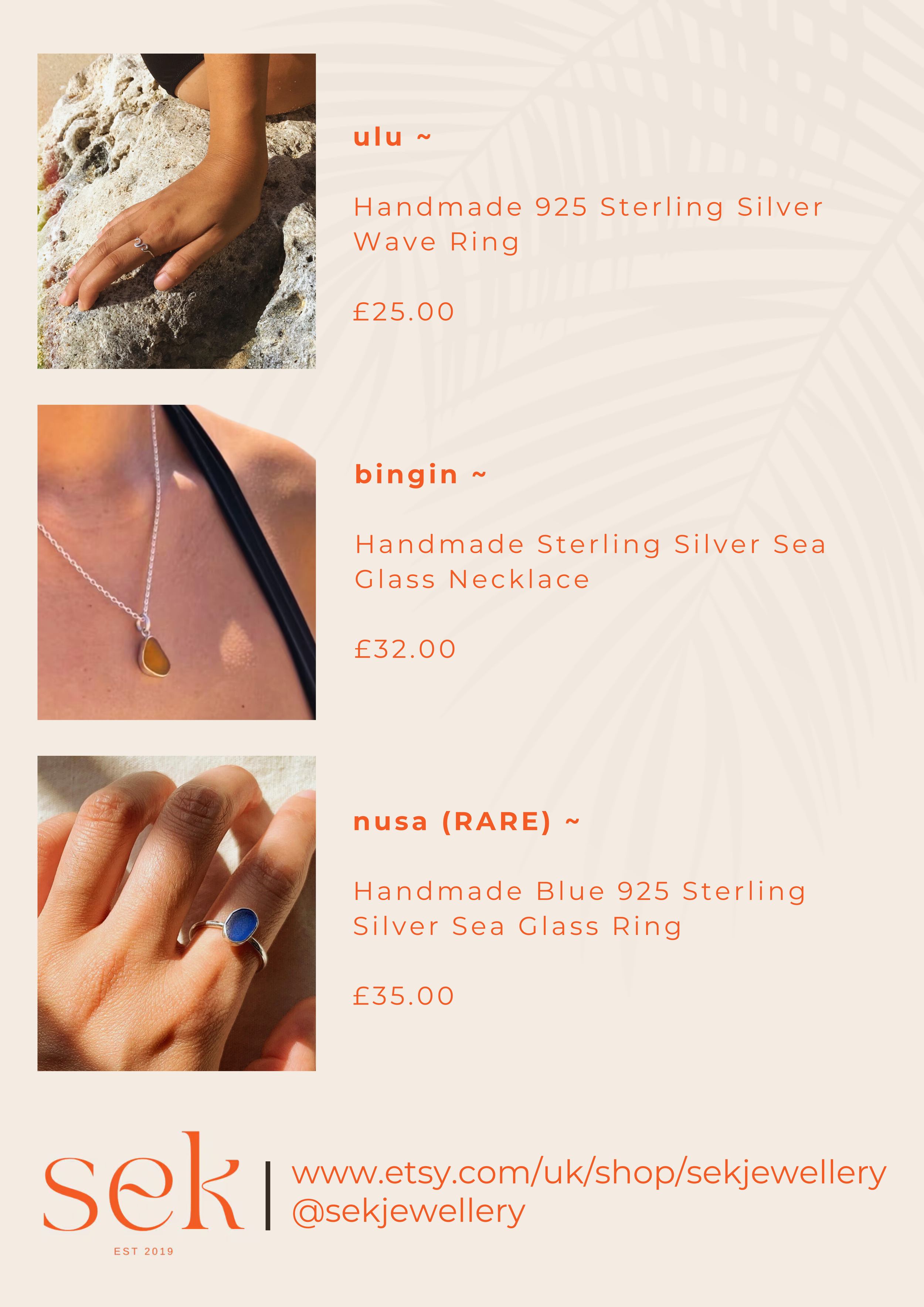
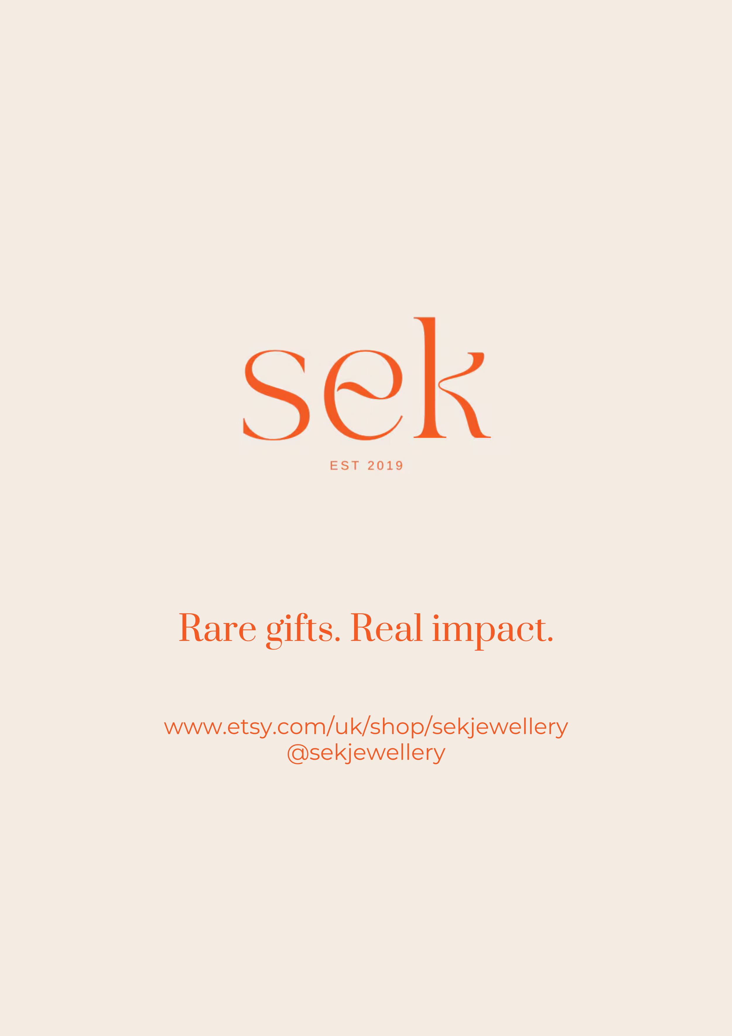
SEK | EVENT FLYERS to promote conscious GIFTING
Goals:
To create professional yet ‘personal’ feeling flyers that gently nudge consumers towards more conscious, feel-good gifting
To raise awareness of Sek and, in particular, the craftisans behind the jewellery/ the fair compensation they receive
To ensure all graphics and design elements feel organic and in keeping with the brand
To encourage shoppers to buy something unique/different
To support both in-person sales at the event and online purchases on Etsy
Sector: Sustainable fashion
Sek is an independent sustainable jewellery brand set up by talented solo entrepreneur Susie Sek. Susie sells beautiful, slowly made rings and necklaces crafted by local artisans in Ubud, Bali. Susie came to me wanting some simple print materials that she could use to promote her brand at a conscious gifting event in London. As a result, I designed a selection of contemporary flyers with bespoke copy that she was able to use to raise brand awareness and display on her stall.
Actions:
▫️ Carried out research into Sek’s brand, values and conscious gifting audience, creating a set of loose flyer mockups to explore tone, layout and copy direction before finalising the approach.
▫️ Developed bespoke, gently persuasive copy and designed a selection of slick, print-ready flyers and brochures focused on feel-good, sustainable gifting, in line with Sek’s brand guidelines.
▫️ Thoughtfully incorporated the client’s existing brand photography, colour palette and typography, ensuring all visuals felt organic and reflective of the slow-made ethos behind the jewellery.
▫️ Structured each flyer to work in a quick-glance, in-person setting, while also subtly guiding customers towards Sek’s Etsy shop for continued engagement post-event.
Outcomes:
Elevated Sek’s presence at the event, helping the brand to gain recognition within the conscious gifting space.
Prompted visitors at the event to engage with the story behind the jewellery and learn more about the craftisans.
Generated strong interest, with attendees taking flyers away and registering for Sek’s newsletter to stay connected post-event (subscriptions ⬆ 10%, social follows ⬆ 10).
Created a bridge between the physical stall and Sek’s online store, supporting continued brand discovery beyond the day.
CLIENT COMMENTS: “I hired Maddie to create some event flyers and brochures for my jewellery pop ups. She is a creative thinker with lots of great ideas. She was able to quickly grasp my brand tone of voice, and she has a sharp eye for crafting catchy tag lines and product descriptions. I look forward to working together again.” – Susie Sek, Founder, Sek
nmg | MONTHLY copy & CONTENT FOR INSTAX, HOTEL CHOCOLAT, MYFUJIFILM, ELEMIS & MORE
Sector: Hospitality, E-commerce, Retail,
NMG (now Narwhal Labs) is a martech agency based in Bristol. The team originally got in touch with me at a time when they were juggling a number of high-profile clients and needed support with monthly copy and content. They were particularly focused on finding a copywriter with strong SEO experience who could produce polished, on-brand copy tailored to each client’s TOV and optimised with the right keywords and links.
I directly supported the content manager with 20+ hours of work each month, helping the team to deliver high-quality blog posts, landing pages and campaign copy that aligned with each client’s strategy. I was often entrusted with fast‑turnaround campaign briefs for instax and Hotel Chocolat, creating event write‑ups and seasonal campaign content. This work helped to strengthen on‑page SEO performance and support overall page ranking across key client sites.
Goals:
To provide ongoing copy and content support that lightened the team’s workload during a busy client period
To deliver high-quality, SEO-optimised content that aligned with each client’s tone of voice and brand guidelines
To consistently replicate distinct brand personalities across multiple client accounts
To manage fast-turnaround campaign briefs for brands like instax and Hotel Chocolat, producing engaging event and seasonal copy
To help strengthen organic search performance and support improved page rankings
To provide edits and amends within an agreed timeframe
To maintain high client satisfaction through reliable delivery and quality content output
Actions:
▫️ Produced a wide variety of SEO-optimised blog posts, PDPs, PLPs and campaign copy for both high-profile clients and smaller businesses, ensuring each piece was aligned with brand tone of voice and content strategy.
▫️ Conducted research into client brands and audiences to inform content structure and messaging.
▫️ Consistently met monthly content deadlines, sticking to the client’s specified timeframe.
▫️ Came up with creative copy for fast-turnaround briefs, including seasonal and event campaigns with limited info or resources.
▫️ Collaborated closely with the content manager to refine content direction, helping to maintain quality across deliverables and ensure timely delivery each month.
▫️ Supported the in-house team during peak periods. This included creating design assets and marketing materials over the Christmas period to support internal NMG projects.
Outcomes:
Successfully supported the content team in delivering high-quality work across all client accounts. Provided monthly content for instax, Hotel Chocolat, MyFujifilm, Fujifilm House of Photography, ELEMIS, The Clinica, SpotDif and StickerShop.
Provided additional in-house design support, creating a bank of branded graphics that the team could use for marketing emails, social media and their company’s sister website.
Helped NMG’s clients achieve key SEO objectives, with numerous blog and web content pieces earning page 1–2 search rankings.
Strengthened NMG’s overall creative output by bringing both copywriting and design expertise to the team’s workflow.
CLIENT COMMENTS: “Maddie has been an absolute joy to work with throughout the campaign. She took the time to fully understand each client’s brand and tone of voice, consistently delivering flawless, high-quality content. Maddie has shown incredible flexibility and professionalism, always handling tight deadlines with ease and positivity. It’s been a pleasure collaborating with her on both a professional and personal level, and I truly hope our paths cross again in the future.” Bradley Burnham – Agency Manager, NMG
“I regularly assign work to Maddie and consistently trust her to deliver copy that meets – and often exceeds – the high standards our clients expect. Her deep understanding of SEO principles, ability to adapt to TOV guidelines, and genuine care for the quality of her work make her an invaluable partner.” Oliver Badcock – Head of Agency, NMG